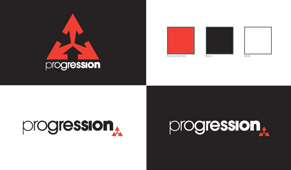
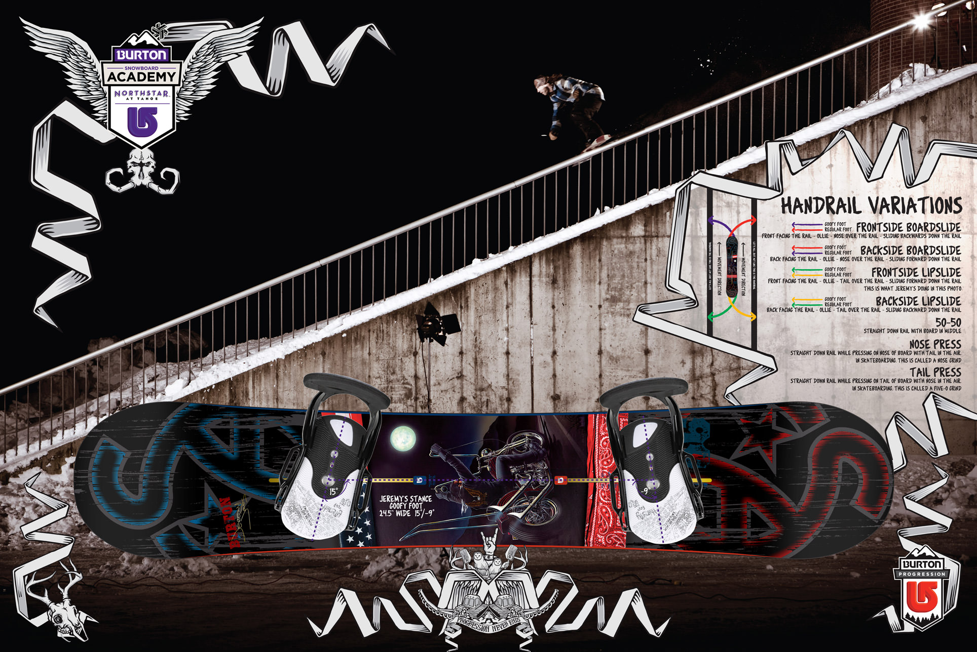
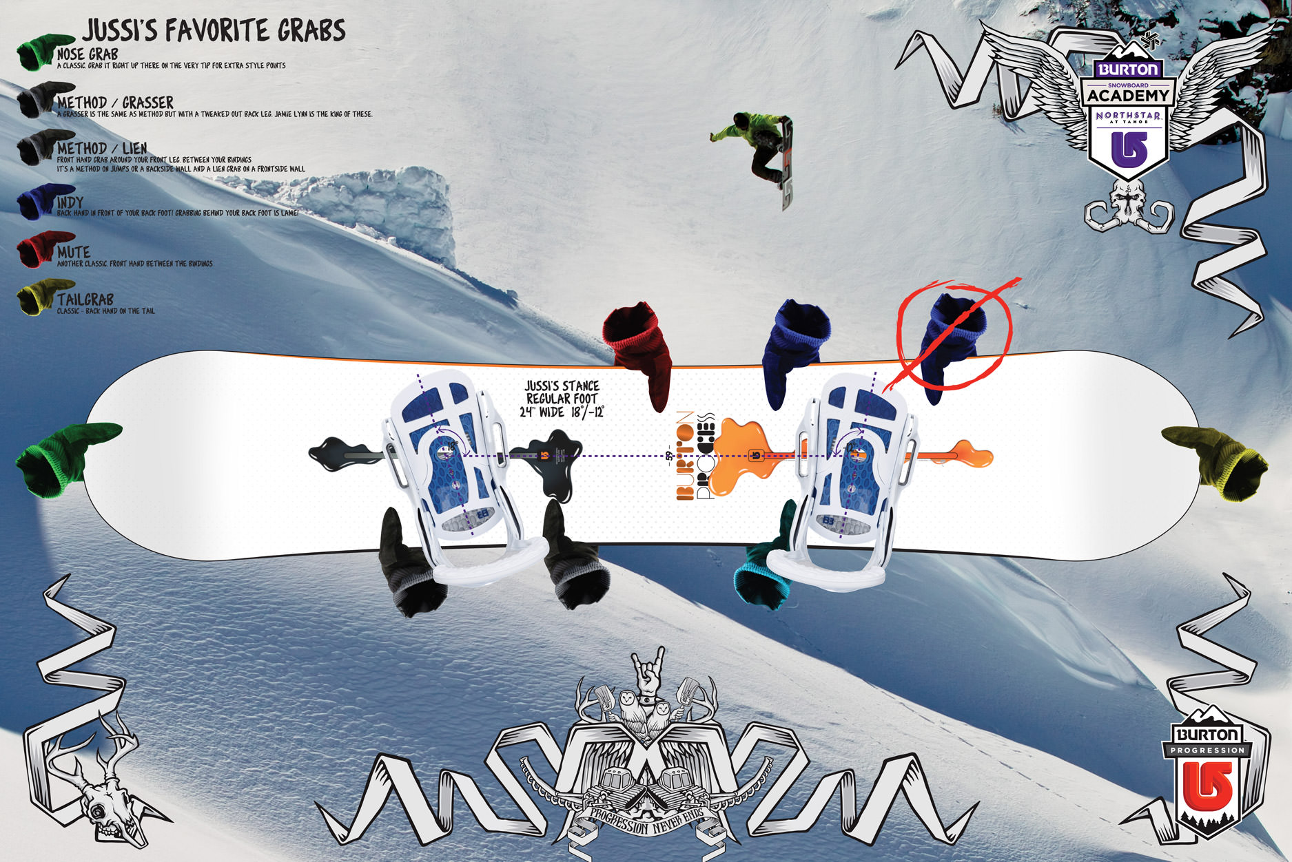
Burton has been the undisputed leader in snowboarding since the sport’s inception, due to an incredible commitment to product development and a tireless devotion to sharing their love of the sport with newcomers and riders of all levels of ability. We created the icon representing their Progression division, dedicated to helping enthusiasts learn to ride better. The logo is made up of positive / negative space arrows, coming from a central point. The outer arrows are meant to show the rider’s progression into becoming a better, more confident rider & the arrows pointing in represent Burton dedication to the sport, giving back to the riders.