

Teaching a racing giant how to sell to consumer base where marketing is king
Advertising
Branding & Identity
Consultation
Marketing
Packaging
Strategy
Advertising
Branding & Identity
Consultation
Marketing
Packaging
Strategy
Teaching an old dog new tricks.
Situation
UVEX wanted to appeal to the youth demographic with a range dedicated to freeski, snowboard and mountain bike markets around the globe.
Objective
Create a sub-brand within the brand to open doors in new markets while not alienating their existing customer base.
Solution
Create action sports segment specific identity, complete with unique packaging & a style guide for reference when working with this new segment.
Results
– Great response from dealers at the tradeshows.
– Broadened customer base by enhanced access to the coveted youth demographic.
– Concepts delivered in style guide by Valhalla used for future products & releases.
Keep scrolling to check out the full story on the project

Looking to appeal to a younger demographic more interested in freeskiing, snowboarding & mountain biking, UVEX came to Valhalla for help & guidance.
A sampling of the style guide is provided below.
UVEX absolutely owns the market in ski racing & racing in wintersports in general. The Winter Olympics are basically a two week commercial for them. They wanted to find a way to appeal to the younger demographic interested in freesking, snowobarding & mountain biking with a sub brand but didn’t want to alienate their existing customer base.
They were looking for a style guide for their German agency to reference while working with these new markets. Consisting of online & print ad campaigns, a brand identity, packaging & photography styling, we essentially created a sub-brand for them to reference while designing for the younger demographic they were targeting.

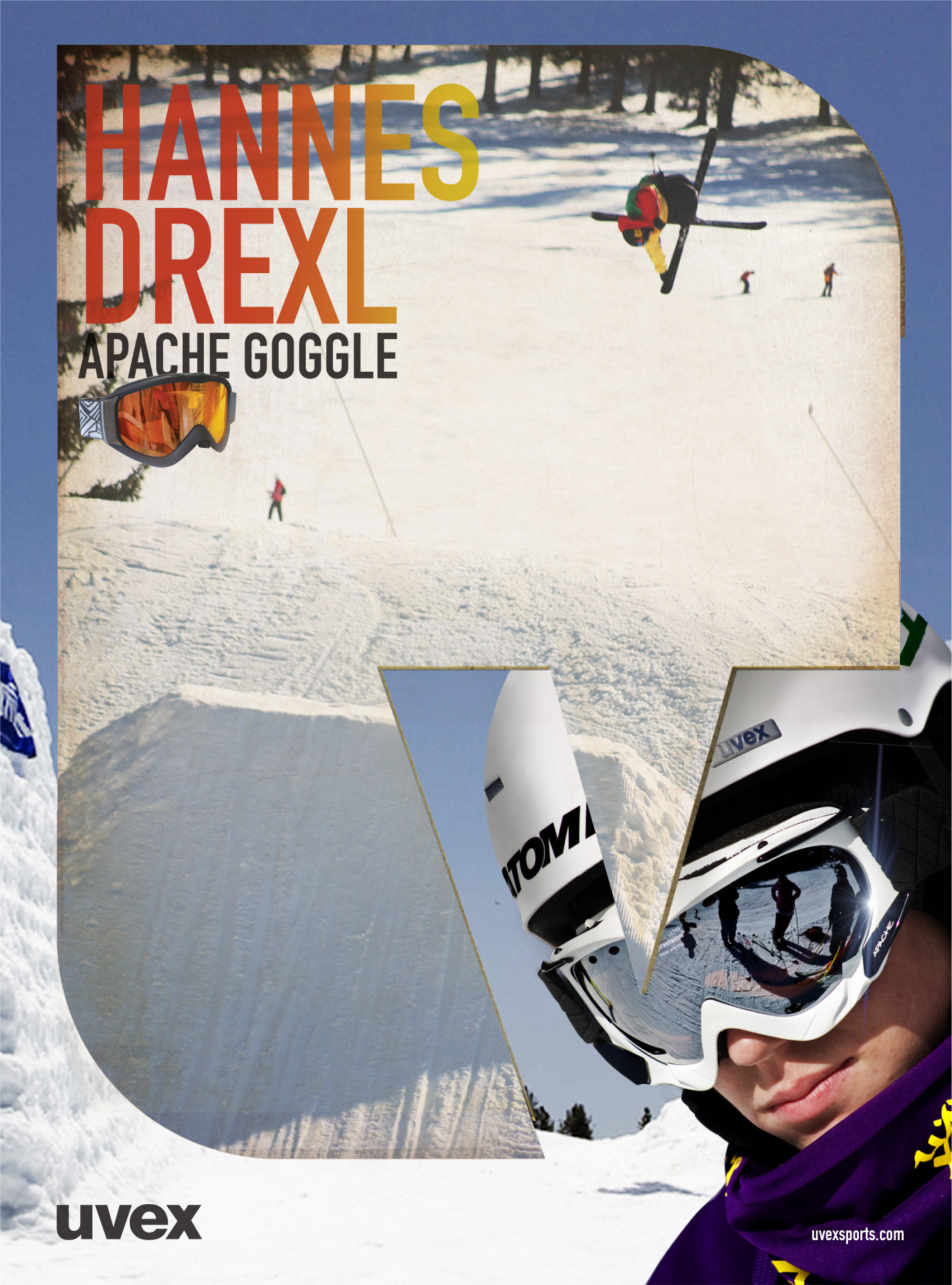
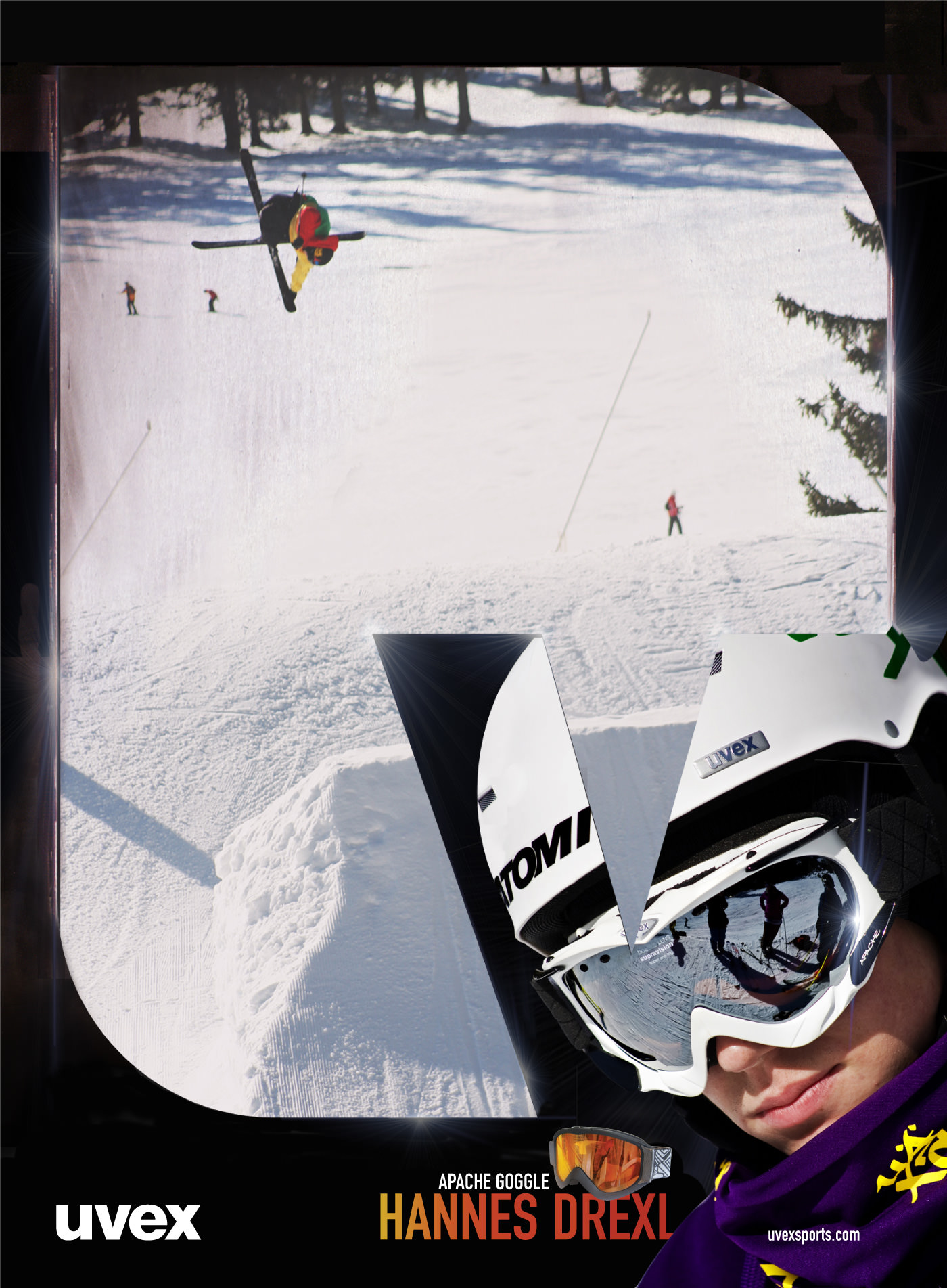
The brand identity was based on the “Knockout V” shape. Taking the V from their UVEX logotype, a hard right angle on the upper left corner faded into rounded corners with a V knocked out from the lower left corner. The decision to choose the V was based on their domination in racing, V is for Victory. The resulting brandable shape could be applied across various mediums resulting in a strong brand identity that was still tightly connected to the main Brand Identity.
The shape would carry over to other aspects of the project. The goggle packaging would have a Knockout V window exposing the goggles inside the box. Ads would highlight the shape as a canvas for displaying athletes, product features or as a window to display imagery. The shape could even be used on products to promote the brand even further.


Looking to appeal to a younger demographic more interested in freeskiing, snowboarding & mountain biking, UVEX came to Valhalla for help & guidance.
A sampling of the style guide is provided below.
UVEX absolutely owns the market in ski racing & racing in wintersports in general. The Winter Olympics are basically a two week commercial for them. They wanted to find a way to appeal to the younger demographic interested in freesking, snowobarding & mountain biking with a sub brand but didn’t want to alienate their existing customer base.
They were looking for a style guide for their German agency to reference while working with these new markets. Consisting of online & print ad campaigns, a brand identity, packaging & photography styling, we essentially created a sub-brand for them to reference while designing for the younger demographic they were targeting.
The brand identity was based on the “Knockout V” shape. Taking the V from their UVEX logotype, a hard right angle on the upper left corner faded into rounded corners with a V knocked out from the lower left corner. The decision to choose the V was based on their domination in racing, V is for Victory. The resulting brandable shape could be applied across various mediums resulting in a strong brand identity that was still tightly connected to the main Brand Identity.
The shape would carry over to other aspects of the project. The goggle packaging would have a Knockout V window exposing the goggles inside the box. Ads would highlight the shape as a canvas for displaying athletes, product features or as a window to display imagery. The shape could even be used on products to promote the brand even further.
ADVERTISING
The campaigns includes athlete & product versions for both print & online advertising. A common problem with action sports advertising is procuring a lifestyle or portrait photo for the ad. The campaigns contained multiple options so the brand could still produce an eye-catching ad whether or not the athlete was available for a dedicated photoshoot.
Print ad samples

Studio portrait action ad
On-site portrait action ad
ADVERTISING
The campaigns includes athlete & product versions for both print & online advertising. The campaigns contained multiple options so the brand could produce an eye-catching ads whether or an athlete was available for a dedicated photoshoot.
Print advertisement samples
Snapshot style portrait action
Studio portrait action ad
On-site portrait action ad

Product 2 page spread ad

Product oriented single page

Studio portrait product
(alternate sryle)
Product oriented 2 page spread ad
Product oriented single page
Studio portrait product
(alternate sryle)
Online ad samples

All ad examples for shape only. Finished ads have rollover animation / motion / etc
Online advertisement samples

Skyscraper online


Wide / Rectangle online ads
All ad examples for shape only. Finished ads have rollover animation / motion / etc
PHOTOGRAPHY
PHOTOGRAPHY
The photography for UVEX was set to be striking, the photograph alone should “say” UVEX, high clarity and full of colors bold colors. Use of a flash fill popped the rider off the background.
Portrait samples

UVEX action photography should be stylized & post processed to fit in with the portrait photography with bold, vivid colors. The look should be similar to that of a user wearing Polarized sunglasses vs normal sunglasses.
Action samples

PHOTOGRAPHY
The photography for UVEX was set to be striking, the photograph alone should “say” UVEX, high clarity and full of colors bold colors. Use of a flash fill popped the rider off the background.
Portrait photography samples
Action photography samples
UVEX action photography should be stylized & post processed to fit in with the portrait photography with bold, vivid colors. The look should be similar to that of a user wearing Polarized sunglasses vs normal sunglasses.
TYPEFACE
UVEX takes no prisoners and either does the font DIN Shrift – Engschrift Alternate.
The standard weight works for most cases but a bold font was supplied for use when necessary.

DIN Shrift – Engschrift Alternate
TYPEFACE
UVEX takes no prisoners and either does the font DIN Shrift – Engschrift Alternate.
The standard weight works for most cases but a bold font was supplied for use when necessary.
DIN Shrift – Engschrift Alternate
Packaging
The Knockout V shape carried over to the packaging, as well. Goggle boxes had a window to show off the product die cut into the shape & helmet boxes had the logo on their “closed” side, which allowed the boxes to double as POP displays.
Packaging
The Knockout V shape carried over to the packaging, as well. Goggle boxes had a window to show off the product die cut into the shape & helmet boxes had the logo on their “closed” side, which allowed the boxes to double as POP displays.
Front / back / side views shows both the Knockout V die cut window & how label wraps around corner.
The branded orange color on the inside of the box pops the goggles off from the background.
Front / back / side views shows both the Knockout V die cut window & how label wraps around corner.
The branded orange color on the inside of the box pops the goggles off from the background.
Helmet box packaging featured a branded inner sleeve would display the product when “Open” and display the brand icon when “Closed”. This created packaging that was not only more durable but also allowed for secondary use of packaging as a POP Display.
Boxes shipped “Closed” (with logo facing out), retailers slide inner sleeve the other direction to display helmet.
Don’t forget to check other similar projects!


Atomic SnowboardingCase Study
Advertising / Branding / Consumer Goods / Marketing / Packaging / Print / Product Design / Promotional
