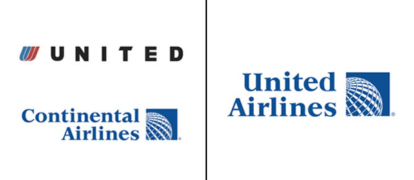
When good logos die
 It’s always sad to see good things die. I wore black for a week after Johnny Cash died. I get sad when I see a crashed up classic car. This is the graphic equivalent of Johnny Cash dying from crashing a hemi ‘Cuda. United Airlines & Continental Airlines recently announced that they were going to merge. Read / See more after the jump


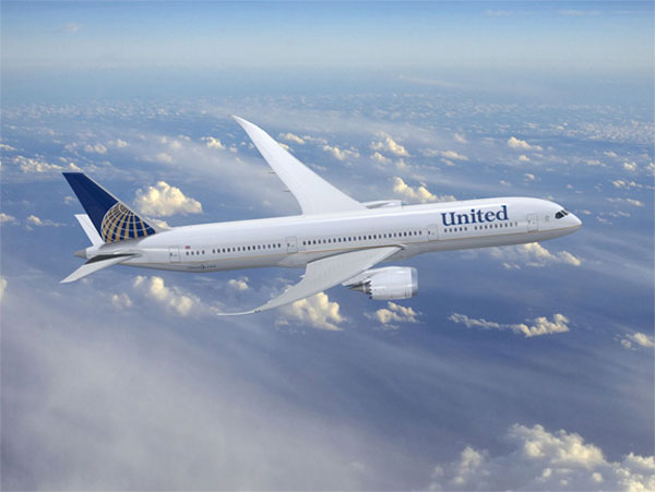
Naturally the answer to the graphic problem of merging these two brands is to combine their logos. Now, let’s see. United is the larger company, has a better brand image and has better branding, so naturally the best answer for the problem is to take Continental’s crappy branding and treat the United name like it. Seriously? That’s the best they could think of?
Click on the pictures above or on the link here to go to Brand New’s site & read their take on it. Be sure to check out their Shining teaser equivalent to this debacle.
[no_social_share_list]
Sorry, the comment form is closed at this time.