Elphi Cycles branding
Finally get to show the branding package I did for Elphi Cycles up in BC! Check it out here Elphi Cycles...
[no_social_share_list]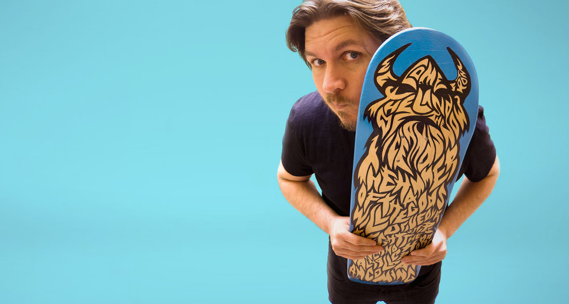
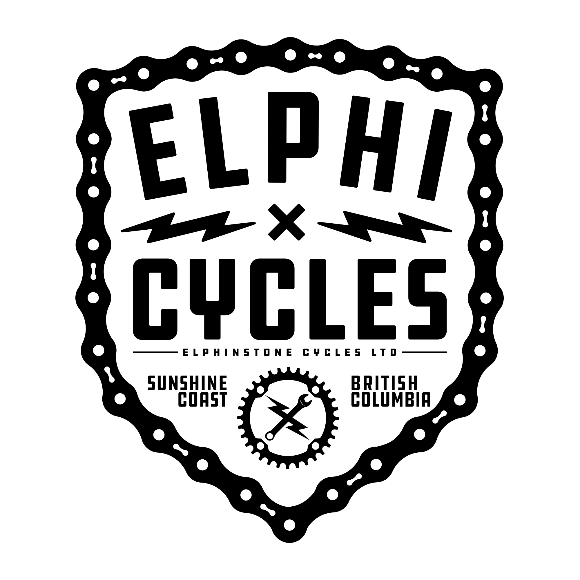
Finally get to show the branding package I did for Elphi Cycles up in BC! Check it out here Elphi Cycles...
[no_social_share_list]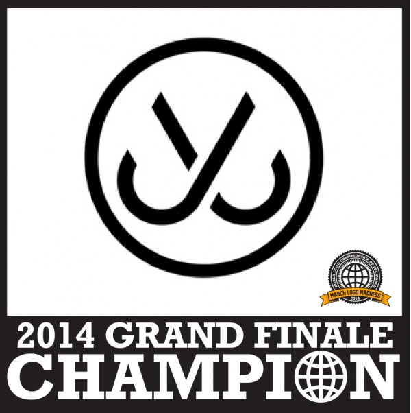
That’s it, that’s all. Fin. Once again, the battles were close with JSLV & Hydro74 at each other’s throats all day long. And it stayed that way. One would go ahead by a vote, then the other would tie it. Then they’d both get a vote....
[no_social_share_list]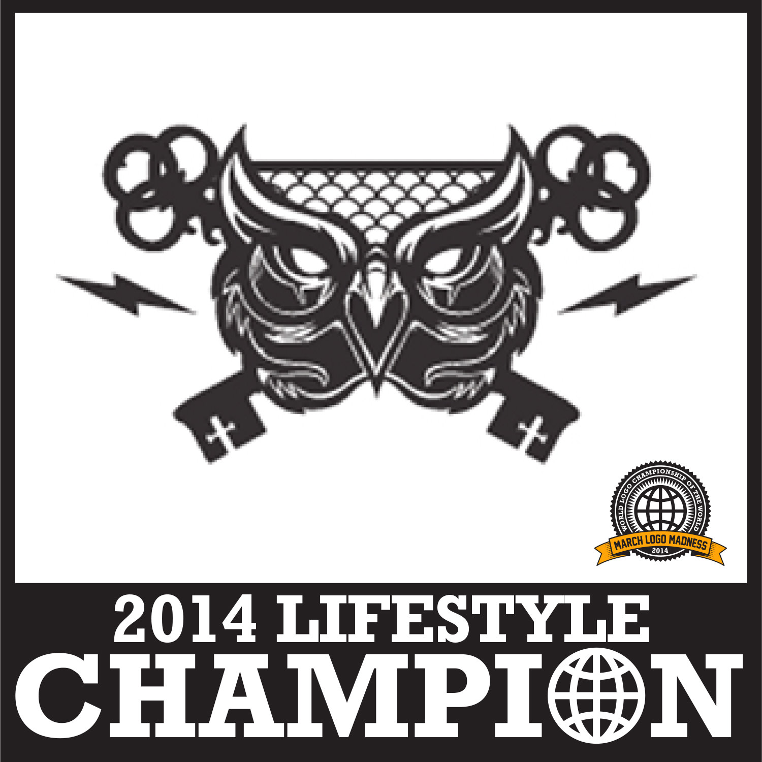
Congratulations go out to last week's Lifestyle Category winner, Hydro74. He brought the heat & took on all comers, including two of my logos (the shadow conspiracy and awsm) along with Nixon, Vans & Upper Playground to take the title. ...
[no_social_share_list]
>Congratulations to Jim Phillips and his Independent Trucks logo for taking the Skate Category championship in the 2014 March Logo Madness competition. Can't say I'm overly surprised since the Indy iron cross is one of my favorite logos ever but none the less, great job...
[no_social_share_list]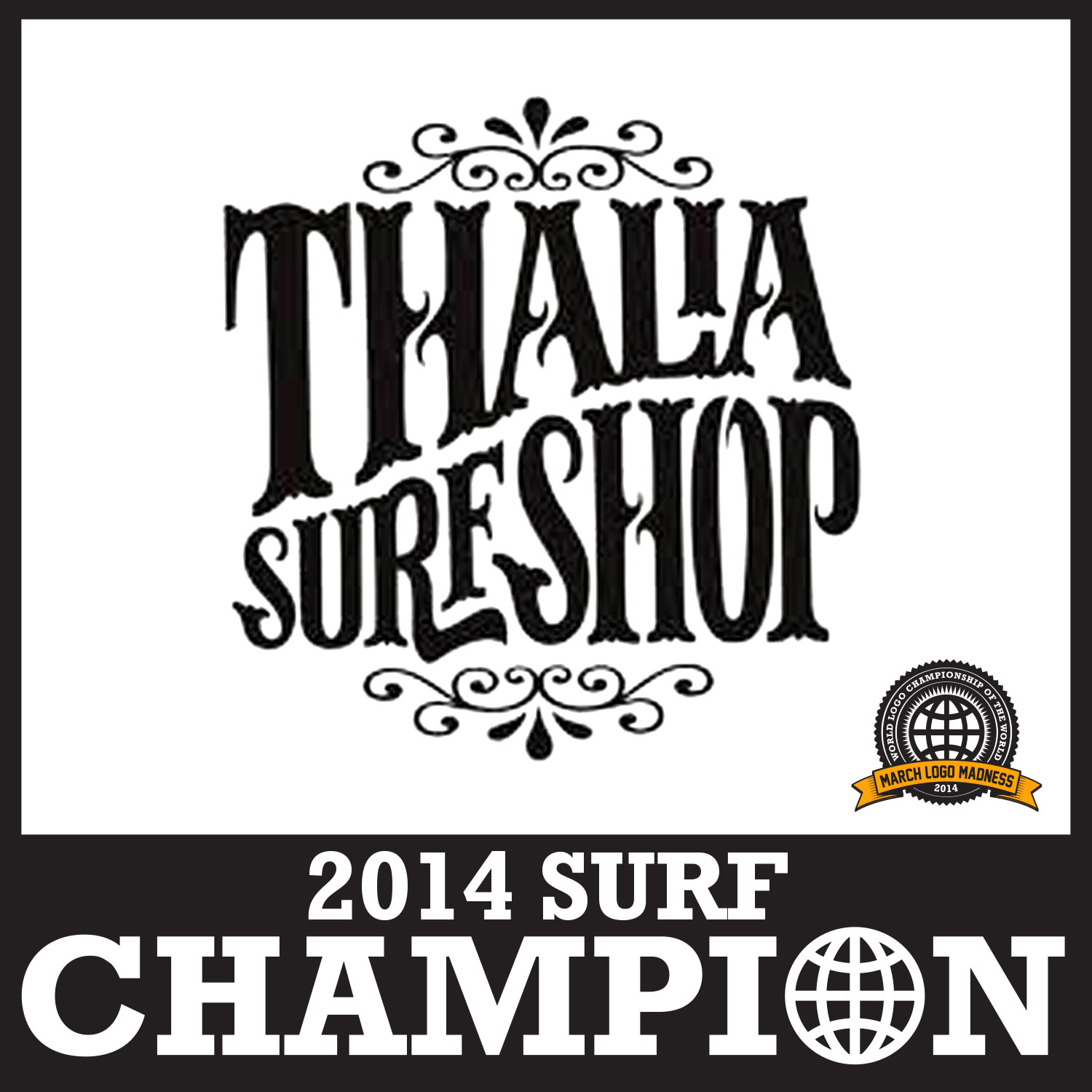
Congratulations to Thalia Surf Shop for taking the Surf Category championship in the 2014 March Logo Madness competition. En route to their win, they took out some heavy hitters; Quiksilver in the semifinals and RVCA in the finals! Good job by the little shop up...
[no_social_share_list]March Logo Madness is back again! Brought back after such a tremendous response last year, the competition is back again this year! Updated so there's four categories which get broken down into DAILY battles. VOTE EVERY DAY for your favorite logo from Surfing, Skateboarding, Snowboarding...
[no_social_share_list]
Great article from the Ottowa Citizen (Via Quipsologies) about Canada's celebrated logo history… I don't notice any Wildcats or Red Dragons logos in there though, eh....
[no_social_share_list]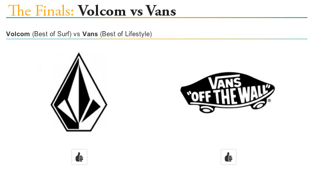
So, this is it, we've reached The Finals. Thousands of votes cast and we're down to two logos. Both are icons in the industry. 90s upstart, Volcom with the Volcom Stone vs 60s originator, Vans' and their "Off the Wall" Skateboard. Round 5 was another...
[no_social_share_list]
Logolounge is having a call for entries for their 8th book. The site is a great resource & the books are a great way for designers to get some recognition. Plus it's aways cool seeing your stuff in print amongst a bunch of other good...
[no_social_share_list]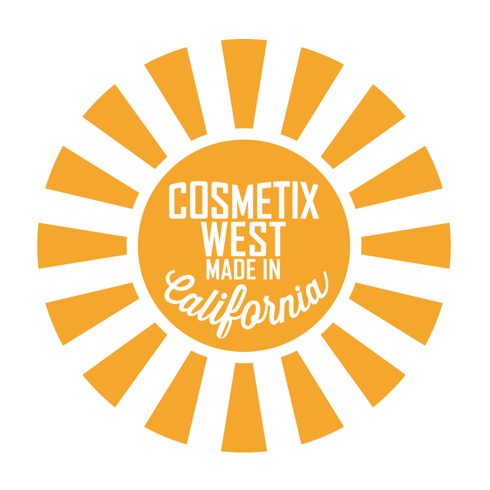
Wrapped up a Made in California logo a couple weeks ago for Cosmetix West, a private label skincare manufacturer based in LA. Pretty excited about how it turned out. They've got it up on the front page of their newly-redesigned website as well. ...
[no_social_share_list]Excited this finally released, keeping tight lipped for the past 5 months has been tough. Last fall I worked closely with XFusion's John Hauer to brand & create the graphics for XFusion's long-awaited jump into the downhill mountain bike fork game. The graphic briefing was...
[no_social_share_list]
Logo I did last summer for for World Industries, one of the most influential companies in modern skateboarding. As soon as I did this one, I knew it was the one to go with and a few rounds of comps later, they agreed. Follow the jump to see a screenshot of the illustrator artboard while I was working on the logo with some other versions / concepts.
[no_social_share_list]Inaugural March Logo Madness is underway, head to March Logo Madness to vote!...
[no_social_share_list]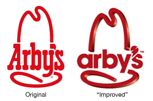
Looks like the folks at Arby’s decided to reinvent themselves, ditching one of the only things the brand had going for it. In Chief Marketing Officer Russ Klein‘s infinite wisdom, he replaced the super-awesome cowboy hat logo with something that looks like a c+ logo project from a community college “Introduction to Graphic Design” course. If you care to read more about our views, follow the jump because there’s a lot to say about this travesty.
[no_social_share_list]Too much hustle around here lately, saw this & couldn't resist popping it up on the blog though. It's a little outdated but still interesting to check out. ...
[no_social_share_list]
All our choices get whittled down to a few. Thanks Logo Design Love...
[no_social_share_list]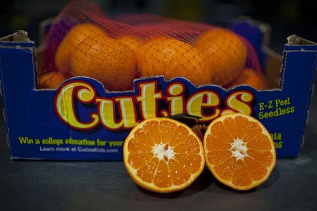
Pretty interesting article over on Yahoo about the Cuties brand of clementines. Very interesting read on how much of an impact the branding has had on the tradition-steeped industry in America. The Big War Over a Fruit...
[no_social_share_list]Video prepared by another branding genius, Saul Bass, for bell systems. It's a bit long with the first half being basic identity design stuff & the second half (around 13 minutes) being the pitch itself. Thanks Under Consideration...
[no_social_share_list]A genius talks about a classic logo. Thanks Under Consideration...
[no_social_share_list]Adam Ladd asked his 5-year-old daughter what she thought of a bunch of logos. Her comments are pretty interesting & it's also scary how many she knows....
[no_social_share_list]Our Angels & Airwaves LOVE cover is featured in the new Motorola Droid Razr commercial. Pretty cool surprise found while watching SNL. Keep a close eye at about 18 seconds in....
[no_social_share_list] Sometimes, in the heat of the battle, we forget to post up stuff that we’ve done. This is one of those times. We started working with Dale Rehberg about a year ago now on his new endeavor, brand manager of NXTZ. Facemask designs turned into catalogs which turned into POP & branding. A season’s designs are down & now we’re working on new designs & more evolved branding. check after the jump for a few more items we’ve done for NXTZ.
Kinda cool seeing my work painted so large. Hard to believe it’s been 9 years since the call from Ronnie saying he needed a logo. Anyways, this is Shadow x Ben Hucke Painting from Shadow Conspiracy
[no_social_share_list] Now that our cards have been on featured on For Print Only, I figure it’s time to get around to putting them here. A few months back, after realizing I had 14 business cards left with a tradeshow in a couple weeks. I worked with Tim at Quality Letterpress to create some pretty cool cards.
Check after the jump for more photos & a bit of a writeup on the cards
[no_social_share_list]Another logo's up in our Logo Rants & Raves section...
[no_social_share_list]Our too-long neglected Logo Rants & Raves section has a new logo. Is it a rant or a rave? Check out our Logo Rants & Raves section to read up on it's history & learn some trivial nonsense about the brand!...
[no_social_share_list] So, the story goes like this. The logo we (American’s) know as the RCA logo is one of the first instances of company branding. See, way back in 1899 the Gramophone company bought a painting by Francis Barraud with a dog listening to a record of his dead owner’s voice. Interested? Follow the jump to find out the whole story.
This is just too cool not to share. The good folks at House Industries took on the herculean task of getting Photo Lettering's catalog of work online for non-house employees to use in their stuff! LOADS of great work over there, so many unique fonts,...
[no_social_share_list]Our work with Angels & Airwaves continues to trickle out. Their newly relaunched website features our custom-created AvA font that we just wrapped up for them a couple days back. Check it out on their site AngelsandAirwaves.com! We'll keep posting more of our work with...
[no_social_share_list]![]() Wrapped this little number up a couple months ago for the folks over at New Balance. In case it’s not obvious enough, it’s the new logo for their baseball division which should have premiered a couple weeks ago at the beginning of Spring Training in Arizona & Florida. After the jump there’s an alternate horizontal version.
Wrapped this little number up a couple months ago for the folks over at New Balance. In case it’s not obvious enough, it’s the new logo for their baseball division which should have premiered a couple weeks ago at the beginning of Spring Training in Arizona & Florida. After the jump there’s an alternate horizontal version.
 Put together a lookbook of our most current work which is available for download. 41 pages, chock full of case studies, branding, advertising & consumer goods.
Download the 6.5mb PDF for free here:Valhalla Lookbook or follow the jump for more shots!
[no_social_share_list]This is huge and it's really just the beginning. Been working for the past couple months with the band Angels & Airwaves and their management on the branding / collateral for their five-year-in-the-making movie, LOVE. The Apple Trailer site just went up this evening, up...
[no_social_share_list]Starbucks celebrated it's 40th Anniversary today by updating their logo. It's really just the same old logo without the wording around the outside but hey, it's new none the less. If you're an addicted fiend who will be thrown off by such a change, they...
[no_social_share_list]
Spent the weekend putting together a collection of branding projects I've done over the years. Most of them are in here, there's a few that aren't which were lost to the great hard drive crash of '03 & a couple which haven't launched yet, so...
[no_social_share_list] We recently finished an icon for the brand Philosophia. The project had to appeal to both sexes (Philo will be the men’s line & Sophia the women’s), be relevant to the marketplace & have a meaning. More of the story after the jump.

Got a call a little while back from Olympic commentator / wiseguy / business owner / pro skiboarder, Todd Richards needing a logo for his new project, AWSM. The creative brief was pretty epic, “bright and colorful and fun. not really needing an icon as the the awsm is the logo too.” Check out AWSM here or check after the jump to see the logo we did in larger format.

So about a week ago Seattle’s Best Coffee decided to drop their new logo. In case you haven’t read really any design blog, msn or yahoo type site or have a water cooler gossiper who knows you like that arty stuff it’s causing a pretty big commotion, generally not the good kind.

Wired has a pretty cool little article on how Google got their colorful logo. The article follows through the preliminary concepts through the final design. Check it out here. Or see more after the jump
 It’s always sad to see good things die. I wore black for a week after Johnny Cash died. I get sad when I see a crashed up classic car. This is the graphic equivalent of Johnny Cash dying from crashing a hemi ‘Cuda. United Airlines & Continental Airlines recently announced that they were going to merge. Read / See more after the jump
Book of the Month time again. This time around, it's an amazing number by Michael Evamy, simply called Logo. It's as thick as a dictionary and has just about every good logo you can imagine. Check out our mini review here....
[no_social_share_list]
Saw this the other day and thought I’d post it up on here. ABCs of branding is done by Jason Dean out of Orlando. The poster is embossed & foil stamped featuring, well, the abc’s of branding. Of interesting note is that there’s only 25 logos and yet the alphabet is 26 letters. Either way, great job. Check them out at The Best Part’s blog & shop. Or just check out the details after the jump.

This coming Thursday, the fine folks at House Industries are putting on an open house / opening reception for their new Eames Century Modern font collection at the Eames office in Santa Monica!
The latest addition to the Logo Rants & Raves section is the Chocolate chunk script logo by Evan Hecox. Is it a rant or rave? While that shouldn't be too hard to figure out, you can check it out in the Logo Rants & Raves...
[no_social_share_list]
Designers are a dime a dozen*, everyone with a computer is a graphics designer (no mis-spell there). Saying a great designers are one in a million would be an understatement. Then there’s that whole other level which is so rare that the level doesn’t even exist, Herb Lubalin was the definition of that kind of level.

Sure yesterday, we put up some good examples of American design on cars from the 70’s but don’t think for a second that the German’s were sleeping at that time. The early 70’s meant business at the Porsche factory, their cars were works of art and to top them off, they painted them amazingly well for the races. Here’s a great set from the Porsche museum of the branding on their racecars. (check after the jump to see out highlights)

Seems like now the only thing that car companies make are remakes of older cool cars, cars with some Green story or just complete garbage. Enough of that though, here’s a cool set with some amazing examples of how cool the typography on old cars used to be (you can also see a condensed version after the jump)
Been cruising around on Flickr looking at different type examples lately. Came across a pretty good set by a fella named Michael Spitz today. Click here to check out his work....
[no_social_share_list]
Twenty years of shredding is a long time. Twenty years ago in snowboarding was a different world. To celebrate it’s 20th anniversary, the MMSC asked us to do a revise of their logo.

That’s right, we’re honored to be featured on LogoLounge.com for their “2009 Logo Trends” article, calling out an opart themed design we did for Adio Skateboards saying “Psychosis: Another new sort of fill is more psychedelic-crazy lines and patterns projected onto other shapes.”
Pretty exited about this one, the article is definitely worth a look if you’re interested in design.
Click Here to check out the whole article, there’s definitely some good stuff in there!
[no_social_share_list]