Arby’s = Fail
Looks like the folks at Arby’s decided to reinvent themselves, ditching one of the only things the brand had going for it. In Chief Marketing Officer Russ Klein‘s infinite wisdom, he replaced the super-awesome cowboy hat logo with something that looks like a c+ logo project from a community college “Introduction to Graphic Design” course. If you care to read more about our views, follow the jump because there’s a lot to say about this travesty.
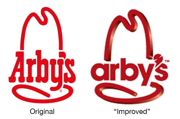
First, let’s look at what we like about the old logo.
1. The Cowboy Hat. Pretty awesome. Their known for roast beef / bbq sandwiches & as luck would have it, when we see a cowboy hat in a restaurants logo, we’re thinking roast beef.
2. The Western Font. Again, with a really cool western font, thinking roast beef over here.
3. How the font works with the hat. This is our favorite part. How great is is that the straight line on the left side hat carries down through the right leg of the uppercase A? The lowercase y carries the other side of the crown down but outdoes the A by curving around at the bottom, making the seam where the crown connects with the brim of the hat. Amazing.
4. It’s one color! Wow, what a concept. A single color logo that works great. Need a simple stamp made of it? Guess what, it will look exactly the same.
Hats off (pun intended) to the designer(s) at the Peskin Sign Co. who came up with this design. Great work.
Now, let’s look at the “uglified” logo.
1. The Font. Really? A lowercase Avant Garde (or derivative) for a western / bbq styled restaurant? Don’t get me wrong, we love Avant Garde, use it all the time but this is a terrible usage.
2. The Random, Unnecessary 3D / highlight / shading on the hat. Why? It’s clearly an afterthought. How can you tell you ask? Look how little space there is between the “hat” part and the apostrophe. It had plenty of space until someone decided that a random 3D effect would look better. How’s that going to look when it’s been photocopied on the letterhead 309 times by a manager in his memos? Also, while we’re on the subject, can the light come from the same place? The light source from the highlights on the crown (vertical) parts of the hat seem to coming from a 3 o’clock area but the light from the bottom of the floating brim & upper hat fold are coming from a 5 o’clock source. Why don’t both crown decenders have highlights at the bottom, not only the right?
3. What’s with the apostrophe? Really though, why’s it way too large? What are the random, asymmetric slashes taken from it? Why is it overlaying the s? Why is it so damn close to the right side of the brim?
4. Why isn’t the font 3D? While you were taking the “I need to put my stamp on this rebrand” train, why not go all the way & make arby’s be 3D also?
This is an incredibly bad rebrand. Arby’s Chief Marketing Officer Russ Klein should be fired for initiating such a tragedy.
[no_social_share_list]
Sorry, the comment form is closed at this time.