House Rules article on The Scout
Check out this interesting little article on one of the best typographers out there right now, Andy Cruz of House Industries....
[no_social_share_list]
Check out this interesting little article on one of the best typographers out there right now, Andy Cruz of House Industries....
[no_social_share_list]Dusty Signs. Love the HOLA Amigos. from Hunter Johnson via from WLT...
[no_social_share_list] Oh hell no. Love snakes, super cool creatures. But see how these have diamond shaped heads? That means they’re not nice snakes. Pretty amazing collection of snake photos over this way.
 Great font called Crescendo by Canadatype, featured in this post over on Quipsologies
More snake photos & fun after the jump!
Great work by Dana Tanamachi at theAce Hotel, chalking it up. She does some amazing work & it's pretty cool to see her rock it on time-lapse camera...
[no_social_share_list] Just some random stuff found around today. Up above is by Fabian Gonzales. This is just too funny, wonder if Marc Jacobs had anything to do with it?
uuggghhhhhh, sad sad day. Long live the tulip.
Nice note from Dr Seuss for the kids of Troy, MI. Scripty Logotypes courtesy of We Love Typography.
Check after the jump for more!
[no_social_share_list]Pretty cool deal here. The Lost Type Co-op is based on the "pay what you can" model for some pretty amazing typefaces. All the donations go to the font designer. Check it out & throw the designers a few bucks, making a font isn't a...
[no_social_share_list]Newly featured in our We Recommend section is Helvetica. A Documentary Film by Gary Hustwit. Great movie for anyone interested in design and even pop culture. It's crazy how far the typeface's grasp is, yet it stays at the forefront of design. Check out our...
[no_social_share_list]Saying Doyald Young was a master typographer is putting it lightly. He was on a whole different level. The poster above started as a gift for a he & Josh Higgins' mutual friend. Unfortunately, Doyald passed away before the project was completed. In stepped Jessica...
[no_social_share_list] Came across a pretty interesting collection of hand-lettered movie titles by German poster designer Hans Otto Wendt for Warner Bros in, well, Germany.
Collection available @ this link or follow the jump for a bit of the story & more examples.
[no_social_share_list]This is just too cool not to share. The good folks at House Industries took on the herculean task of getting Photo Lettering's catalog of work online for non-house employees to use in their stuff! LOADS of great work over there, so many unique fonts,...
[no_social_share_list]Our work with Angels & Airwaves continues to trickle out. Their newly relaunched website features our custom-created AvA font that we just wrapped up for them a couple days back. Check it out on their site AngelsandAirwaves.com! We'll keep posting more of our work with...
[no_social_share_list]Nice little hello today from Type Union with it's feature on Optical Dillusion...
[no_social_share_list]Cool Video we found over on Under Consideration's Quipsologies blog originally by Clim. We unofficially rolled a similar saying for a while there, We Make It Better, until our friends @ Shilo heisted it & rolled out We Make it Good a few years back....
[no_social_share_list]Another random post for you all today. What you're looking at up above is the seriously ridiculously awesome work of ...
[no_social_share_list]Pretty cool news here that I spotted over on Grain Edit a few days ago. Back Issues of U&lc (that's upper & lower case) magazine are available online! The first 3 are up, AD'd by the late, great Herb Lubalin! Check em out while they're...
[no_social_share_list]Our Optical Dillusion font was featured on Under Consideration's Quipsologies blog a few days back. Pretty cool to be amongst such amazing work! It's currently on page 9 but that'll probably change by the end of the day. Click on the pick up above to...
[no_social_share_list]
The Ampersand symbol, every designer’s long-time beloved friend has an interesting story. Around the world, it’s known as “the and sign” but did you know that it was once the 27th letter in the alphabet? What about how it got it’s name? Read more & see some cool examples inside.

Pretty good work here by Julian Hansen. A crazy flow chart of how to find a typeface. Doing an infographic and you cried during Terminator? He’s got you covered. Don’t like the type on highways and you’re ok if it’s Swiss? Helvetica’s your answer. Pretty cool, check after the jump for details and a full view.

Raygun Magazine came out in the mid 90s and was heralded by the design community as being revolutionary, rule breaking, fancy, wretched, amazing and just about everything in between. Perusing Flickr today I came across a set of the magazine’s covers, check them out after the jump.

Seen his work around for a little while now but today’s the first time that I went to his site and let’s just say that it’s impressive. Lots more after the jump.

Popping up a few amazing posters I’ve run across the past few months. A little of this, a little of that. Think of it as a St Patricks Day present from us to you only without the nonsense that’s become synonymous with St Patty’s day. Check out more after the jump.

Designers are a dime a dozen*, everyone with a computer is a graphics designer (no mis-spell there). Saying a great designers are one in a million would be an understatement. Then there’s that whole other level which is so rare that the level doesn’t even exist, Herb Lubalin was the definition of that kind of level.

Seems like now the only thing that car companies make are remakes of older cool cars, cars with some Green story or just complete garbage. Enough of that though, here’s a cool set with some amazing examples of how cool the typography on old cars used to be (you can also see a condensed version after the jump)
Been cruising around on Flickr looking at different type examples lately. Came across a pretty good set by a fella named Michael Spitz today. Click here to check out his work....
[no_social_share_list]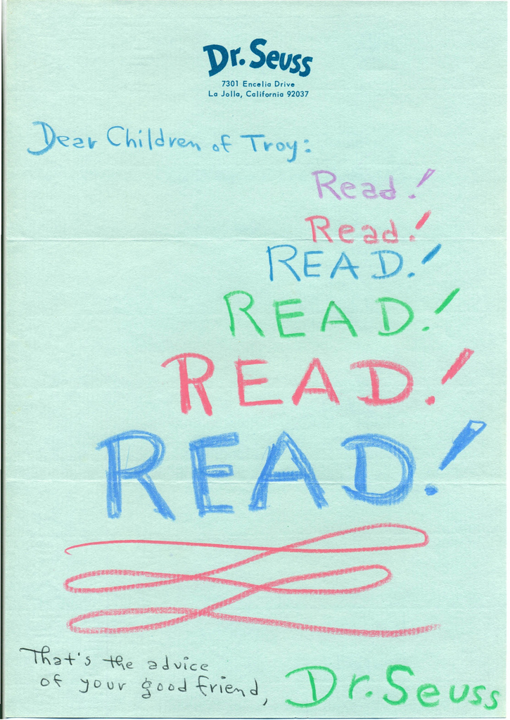