Great app for font nerds
House Industries released a Photolettering app for the iPhone today. The Photo Lettering font collection is amazing, definitely a great buy to support such an amazing font house. Pun intended....
[no_social_share_list]
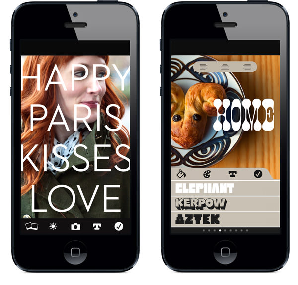
House Industries released a Photolettering app for the iPhone today. The Photo Lettering font collection is amazing, definitely a great buy to support such an amazing font house. Pun intended....
[no_social_share_list]Check out this interesting little article on one of the best typographers out there right now, Andy Cruz of House Industries....
[no_social_share_list]Dusty Signs. Love the HOLA Amigos. from Hunter Johnson via from WLT...
[no_social_share_list] Oh hell no. Love snakes, super cool creatures. But see how these have diamond shaped heads? That means they’re not nice snakes. Pretty amazing collection of snake photos over this way.
 Great font called Crescendo by Canadatype, featured in this post over on Quipsologies
More snake photos & fun after the jump!
Great work by Dana Tanamachi at theAce Hotel, chalking it up. She does some amazing work & it's pretty cool to see her rock it on time-lapse camera...
[no_social_share_list] Louise Fili, one of the most amazing type designers out there, crushes it again with this book & it’s cover that she put together with her husband, Steve Heller. Check after the jump for a few sample spreads or check it out here.
Pretty cool deal here. The Lost Type Co-op is based on the "pay what you can" model for some pretty amazing typefaces. All the donations go to the font designer. Check it out & throw the designers a few bucks, making a font isn't a...
[no_social_share_list] Now that our cards have been on featured on For Print Only, I figure it’s time to get around to putting them here. A few months back, after realizing I had 14 business cards left with a tradeshow in a couple weeks. I worked with Tim at Quality Letterpress to create some pretty cool cards.
Check after the jump for more photos & a bit of a writeup on the cards
[no_social_share_list]Newly featured in our We Recommend section is Helvetica. A Documentary Film by Gary Hustwit. Great movie for anyone interested in design and even pop culture. It's crazy how far the typeface's grasp is, yet it stays at the forefront of design. Check out our...
[no_social_share_list]Saying Doyald Young was a master typographer is putting it lightly. He was on a whole different level. The poster above started as a gift for a he & Josh Higgins' mutual friend. Unfortunately, Doyald passed away before the project was completed. In stepped Jessica...
[no_social_share_list] Came across a pretty interesting collection of hand-lettered movie titles by German poster designer Hans Otto Wendt for Warner Bros in, well, Germany.
Collection available @ this link or follow the jump for a bit of the story & more examples.
[no_social_share_list]This is just too cool not to share. The good folks at House Industries took on the herculean task of getting Photo Lettering's catalog of work online for non-house employees to use in their stuff! LOADS of great work over there, so many unique fonts,...
[no_social_share_list]Our work with Angels & Airwaves continues to trickle out. Their newly relaunched website features our custom-created AvA font that we just wrapped up for them a couple days back. Check it out on their site AngelsandAirwaves.com! We'll keep posting more of our work with...
[no_social_share_list] Put together a lookbook of our most current work which is available for download. 41 pages, chock full of case studies, branding, advertising & consumer goods.
Download the 6.5mb PDF for free here:Valhalla Lookbook or follow the jump for more shots!
[no_social_share_list]Nice little hello today from Type Union with it's feature on Optical Dillusion...
[no_social_share_list]Cool graphic design oriented Venn Diagram by How Would You Like Your Graphic Design?. A 160pg PDF of Stefan Kanchev's work on logo design from behind the Iron Curton on LogoBlink. In line with the random title page link from the other day is all...
[no_social_share_list]Cool Video we found over on Under Consideration's Quipsologies blog originally by Clim. We unofficially rolled a similar saying for a while there, We Make It Better, until our friends @ Shilo heisted it & rolled out We Make it Good a few years back....
[no_social_share_list]This is huge and it's really just the beginning. Been working for the past couple months with the band Angels & Airwaves and their management on the branding / collateral for their five-year-in-the-making movie, LOVE. The Apple Trailer site just went up this evening, up...
[no_social_share_list]Another random post for you all today. What you're looking at up above is the seriously ridiculously awesome work of ...
[no_social_share_list]On our semi-regular list of checks is the DDC site. Draplin & I have been running in the same circle for a number of years & only a matter of time until our paths cross in person. It's always interesting to see what he has...
[no_social_share_list]Pretty cool news here that I spotted over on Grain Edit a few days ago. Back Issues of U&lc (that's upper & lower case) magazine are available online! The first 3 are up, AD'd by the late, great Herb Lubalin! Check em out while they're...
[no_social_share_list]Our Optical Dillusion font was featured on Under Consideration's Quipsologies blog a few days back. Pretty cool to be amongst such amazing work! It's currently on page 9 but that'll probably change by the end of the day. Click on the pick up above to...
[no_social_share_list]
The Ampersand symbol, every designer’s long-time beloved friend has an interesting story. Around the world, it’s known as “the and sign” but did you know that it was once the 27th letter in the alphabet? What about how it got it’s name? Read more & see some cool examples inside.
We don't post a ton about surfing on the blog but we saw this over on Todd Richard's AWSM site today and thought it was pretty relevant to our deal. Great title graphics, interesting editing & random Iron's brother looking like Eazy E in a...
[no_social_share_list]
File this under “most awesome things anyone’s ever done, ever.” More inside

Dropped a font this week named Optical Dillusion. Two years in the making and countless minuscule changes and tweaks which nobody but us would ever notice it’s ready to go. If you want to see more or hear the story behind it, follow the jump!

Pretty good work here by Julian Hansen. A crazy flow chart of how to find a typeface. Doing an infographic and you cried during Terminator? He’s got you covered. Don’t like the type on highways and you’re ok if it’s Swiss? Helvetica’s your answer. Pretty cool, check after the jump for details and a full view.

Raygun Magazine came out in the mid 90s and was heralded by the design community as being revolutionary, rule breaking, fancy, wretched, amazing and just about everything in between. Perusing Flickr today I came across a set of the magazine’s covers, check them out after the jump.

Seen his work around for a little while now but today’s the first time that I went to his site and let’s just say that it’s impressive. Lots more after the jump.

Popping up a few amazing posters I’ve run across the past few months. A little of this, a little of that. Think of it as a St Patricks Day present from us to you only without the nonsense that’s become synonymous with St Patty’s day. Check out more after the jump.

It’s always fun to look through the great work of the past. While many people I know dislike them for some reason, I’ve always been a fan of old posters. It’s nice to look at packaging from yesteryear as well, it’s like looking through the window to a time before focus groups and execs dabbling in everything they get the chance to.

This coming Thursday, the fine folks at House Industries are putting on an open house / opening reception for their new Eames Century Modern font collection at the Eames office in Santa Monica!
The latest addition to the Logo Rants & Raves section is the Chocolate chunk script logo by Evan Hecox. Is it a rant or rave? While that shouldn't be too hard to figure out, you can check it out in the Logo Rants & Raves...
[no_social_share_list]
Designers are a dime a dozen*, everyone with a computer is a graphics designer (no mis-spell there). Saying a great designers are one in a million would be an understatement. Then there’s that whole other level which is so rare that the level doesn’t even exist, Herb Lubalin was the definition of that kind of level.
Been cruising around on Flickr looking at different type examples lately. Came across a pretty good set by a fella named Michael Spitz today. Click here to check out his work....
[no_social_share_list]