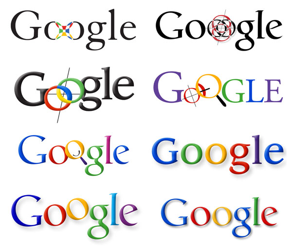
Evolution of the Google Logo

Wired has a pretty cool little article on how Google got their colorful logo. The article follows through the preliminary concepts through the final design. Check it out here. Or see more after the jump
Found an article on Wired on how Google got it’s colorful logo. I can’t say it’s in my “favorite logos ever” mental file but it’s always interesting to see how people arrive at the final result. Click on the picture above to go directly to the article. The evolution starts on the top lefts and zig-zags across & down until you’re at the final logo on the bottom right.
Here’s a bit from the Wired article:
In just a few short years, Google’s logo has become as recognizable as Nike’s swoosh and NBC’s peacock. Ruth Kedar, the graphic designer who developed the now-famous logo, shows the iterations that led to the instantly recognizable primary colors and Catull typeface that define the Google brand. Kedar met Google co-founders Sergey Brin and Larry Page through a mutual friend nine years ago at Stanford University, where she was an assistant professor. Page and Brin, who were having trouble coming up with a logo for their soon-to-launch search engine, asked Kedar to come up with some prototypes. “I had no idea at the time that Google would become as ubiquitous as it is today, or that their success would be of such magnitude,” Kedar says


Sorry, the comment form is closed at this time.